-
Thank you for visiting HeavyEquipmentForums.com! Our objective is to provide industry professionals a place to gather to exchange questions, answers and ideas. We welcome you to register using the "Register" icon at the top of the page. We'd appreciate any help you can offer in spreading the word of our new site. The more members that join, the bigger resource for all to enjoy. Thank you!
You are using an out of date browser. It may not display this or other websites correctly.
You should upgrade or use an alternative browser.
You should upgrade or use an alternative browser.
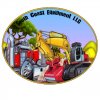
New logo is finished. What do ya think...???
- Thread starter Hallback
- Start date

kshansen
Senior Member
- Joined
- Mar 11, 2012
- Messages
- 11,165
- Location
- Central New York, USA
- Occupation
- Retired Mechanic in Stone Quarry
Looks pretty but if I was to see it on a truck passing by I don't think I would be sure what the name was. Took a second sitting here to see it says Pacific. My opinion is worth everything you pay for it!
mitch504
Senior Member
I like it.
Hallback
Senior Member
Thanks guys!
The designer was Brian Weddle at 187 Graphics. You can find him on Facebook if you need anything done and he does everything from logos to shirts,ect.
The designer was Brian Weddle at 187 Graphics. You can find him on Facebook if you need anything done and he does everything from logos to shirts,ect.
kiwi450x
Well-Known Member
Yeah, I like it too.
Hallback
Senior Member
I am having hoodies, 1/4 zips and T-shirts made.
Vigilant
Senior Member
- Joined
- Jan 8, 2011
- Messages
- 953
- Location
- Eastern NC
- Occupation
- Attitude Adjuster at the Graybar Hotel
I would change the font to cursive, and make it somewhat Filla-esque.
Aussie Leroy
Senior Member
Hallback Well Done looks good, Cheers Leroy
Aussie Leroy
Senior Member

My Son Designed our Logo for My Asphalting division, and stuck it on the crew truck Cheers Leroy
We have an Cat AP 300 And a AP 600D
I've sat through several seminars on advertising and logo's on machines and trucks, everyone says less is more, people don't care about looks except those doing the advertising and those in the business, everyone else looks at something simple to read and can be read fast from a passing truck on the road, all the graphics and neat background stuff makes it harder to read, people like simple and have a phone number to jot down, nothing more, they base more off of what the truck, machine and what the logo is on than the logo itself.
There are several trucks in my area that have so much writing on and graphics you have to stand there a few minutes to ever be able to read it all and then its all forgotten, yea its neat, colorful and etc but after a while nobody notices, because it can't be read as they drive by on the road, it has to be read while the truck is sitting. I'm never quite got that until some locals made comment on the colorful trucks, which was "I wonder if their trying to overcompensate for poor quality work" I was shocked and asked why the negative comment and they told me, everyone hates those seeing those trucks, its so much its a turn off. So I did a unofficial survey of anyone I met, what does the average person like to see daily on a truck or machine and over a 100 locals said nothing but a readable name,and a phone number that is a font that is like what you'd find in a phone book, nothing fancy, flashy or extensive, just plain, simple and readable, everything else was just plain a turn off. Ironically the very same thing I was told in the seminars I'd attended. Just my two cents worth.
There are several trucks in my area that have so much writing on and graphics you have to stand there a few minutes to ever be able to read it all and then its all forgotten, yea its neat, colorful and etc but after a while nobody notices, because it can't be read as they drive by on the road, it has to be read while the truck is sitting. I'm never quite got that until some locals made comment on the colorful trucks, which was "I wonder if their trying to overcompensate for poor quality work" I was shocked and asked why the negative comment and they told me, everyone hates those seeing those trucks, its so much its a turn off. So I did a unofficial survey of anyone I met, what does the average person like to see daily on a truck or machine and over a 100 locals said nothing but a readable name,and a phone number that is a font that is like what you'd find in a phone book, nothing fancy, flashy or extensive, just plain, simple and readable, everything else was just plain a turn off. Ironically the very same thing I was told in the seminars I'd attended. Just my two cents worth.
Aussie Leroy
Senior Member
Randy88; You are right in all you say, The oval A1 Asphalting is our Logo, But for fun we put the skull man stickers on a couple trucks more for the young blokes that we employ, Also our Opposition/Enermy talk about the skullman and Thats the BEST Advertizing you will ever have.
Most of all work has to be FUN Cheers Leroy
Most of all work has to be FUN Cheers Leroy
Most of all work has to be FUN Cheers Leroy
Absolutely Leroy!!
redneckchevy9
Well-Known Member
Randy88; You are right in all you say, The oval A1 Asphalting is our Logo, But for fun we put the skull man stickers on a couple trucks more for the young blokes that we employ, Also our Opposition/Enermy talk about the skullman and Thats the BEST Advertizing you will ever have.
Most of all work has to be FUN Cheers Leroy
I always get a kick out of seeing a truck that has "something else" on it. Be it some secondary logo or any other company/equipment decal. I love that logo and maybe it's because I work in a lumberyard. I could see that on a door & look good. I think you would have to make it pretty decent size, but not something that takes up the whole door. Also, with the red in the logo, I hope the trucks match in color or are painted a nice contrasting color - I think that would bring the paint & logo all together and act as 1 statement.
glenlunberg
Senior Member
Looks good. I like the design and fonts of it.
axeman73
Member
Cool logos